By Yaming Chi, Boston Chinese Photographers’ Association (BCPA)
“Have you ever seen people in museums looking at a picture like this?” Mary Sherman started her lecture to a group of amateur photographers in BCPA with a question. To make sure everyone followed what her ‘this’ meant, she went up to the blackboard, drew a rectangle, then placed her face less than 3 inches from it and slowly moved her head along the sides. For half a minute or so I heard absolute silence from the audience with, perhaps, few occasional giggles. Yes indeed I have as I recalled, but I had thought the person did so must have had a really bad eyesight – that was many years ago in the Art Institute of Chicago. But no, as she moved away from the board and explained. People were looking for (and look at) what connected different elements in a picture. It more or less could be thought of as the flow, or chi (氣) in Chinese Taoism philosophy, that’d be linked by colors, lines, shapes, textures and values in a pictorial artwork.

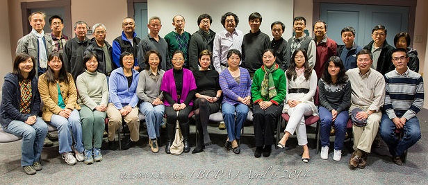
Group picture after the lecture (provided by BCPA).
Ms. Sherman is a fine artist, the founder, curator and director of TransCultural Exchange. She teaches 2-Dimensional design objects in BU, BC and Northeastern University. Ever so often she lectures to various groups and organizations. Last Sunday she was invited by the Boston Chinese Photography Association to give a talk entitled “Art of Composing -Think Before You Shoot”. It was an eye-opening lesson to many. I for one had never thought a closer look (yes literally put oneself 3 inches away from a picture) at some elements and follow them around would lead me to the inner flow of the artwork, or to an “Eh, that’s not working out.” “You must look at these elements as what they are,” explained Ms. Sherman, without any emotional attachment. Color grey, for example, is it light or translucent or opaque, but not depressing, sad, or death. Lines, are they straight, curved, connected, but not stunting, mellow, or happy. It is only to the very end do you reflect what content the elements are put together for.
To further demonstrate the ideas and technique, Ms. Sherman put the audience in an exercise. She divided the attendants in small groups, and each group was given a picture to look at. My group had “Land of Lincoln”, a contemporary painting by Roger Brown. We looked at the basic elements and then objects that were presented by the artist in a semi abstract fashion – straight lines, rectangle shapes, unusual green and red colors, and then tall distorted buildings stretching to red cloud like objects, complex street webs, roof tops, people standing by windows and on streets with their shadows pointing to different directions, etc. There was so much to see in a picture, yet the more you looked at it the more you’d discover until finally, perhaps and only perhaps, you might come to realization what message the artist intended to convey. In a liberal and modern society, people become self-centered, isolated and disconnected. There is more modernism than humanism in the society we live, a society that’s ideologically free yet distorted out of shape within.
At the request of BCPA, Ms. Sherman led the discussion to critics for selected photographs taken by the members. Using the knowledge we just learned, some of the ‘nice shots’ showed their weaknesses, and some of the ‘good shots’ we now could reason why. There were of course always a few that not everyone could see eye-to-eye. That would be the beauty of artistry. For one person something that’s beautiful can be not-so-beautiful or even ugly to others. But one has to learn how to appreciate. We’ll start with the 5 formal elements: color, line, shape, texture and value. So next time you are in MFA, and see a person who places his eyes a few inches away from a picture and moves his head around, that would be Daryl, Mingwei, or myself. And perhaps I’ll see you do the same there.